
 UI design can be a big hit or miss. Often times we try to go for form over function, without really thinking about what the user wants and need.
Sure, flashy flash websites are awesome, but what happens when the load time is 30 seconds? What happens when a user comes to your site and watches the flash intro, but loses interest and doesn’t proceed any further because they weren’t on an informational landing page?
What happens when you launch contests that have confusing and dizzying design where the user can’t understand what to do or where to go?
Let’s take apart a website that recently launched a user powered tournament. They have a very unique tournament system- not replicated at this moment by any other site- that allows users to vote on matchups through 6 rounds of voting- til they get to the final round.
1. Call to Action
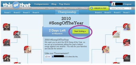
You’ll note that when you get to the tournament page, there’s an immediate call to action front and center.
2) Necessary information
To the left of the call to action is the amount of days left in the round. Users can see, at a quick glance, how long they have to share and/or vote. Anything that the user needs, is right here.

3) Breadcrumbs
Breadcrumbs are a MUST when designing a website. This may sound like a stupid thing to mention, but sometimes people don’t think about what happens at each step of their site.
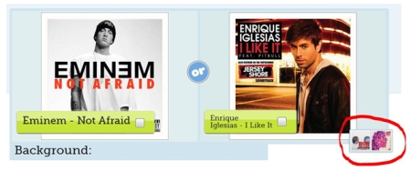
For instance, after users start voting, they’re going to end up on the screen above. You’ll see that on this particular match-up, there’s an easy way to navigate to the next match-up. Having breadcrumbs can possibly help move along the conversion process because users can easily find where they’ve been, or where they need to go.
4) Keep it Simple
As mentioned before, don’t try to go all glamorous and super busy. Yes, it might look pretty, but if your users can’t accomplish what you want them to, or can’t see what you’re trying to drive their eyes to, then you’ve completely failed in designing your interface.
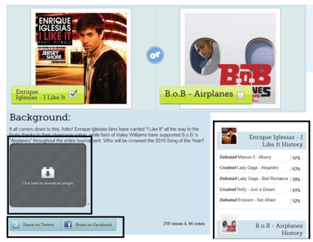
You’ll note on the above screen, there’s an area where the user can view the artist’s videos (I actually don’t have the plugin installed… total fail on my end. Both videos ARE, in fact, there!) so that the user doesn’t need to roam around on YouTube looking for the official video.
There is also the history of the previous match-ups, so they can easily see who Enrique beat.
5) Simple Social Sharing buttons
I know a ton of people think they need every single social sharing button under the sun. The fact of the matter is, half of them won’t get clicked on and they look really ugly.
You can probably take notice of where your site/content is being shared most, naturally. If the most people are sharing on Facebook and Twitter, naturally (unless you’re trying to capture a new market) you would only need those social sharing buttons.

It keeps it clean, classy and simple.
The interface that you’re bringing your users into can either make or break the amount that comes back. Your bounce rate will be significantly lower if you can immediately capture your user’s attention and make everything they need to do simple and easy to locate. This was just a simple UI post, but hopefully it helps those who are new to site design.
Selena Narayanasamy eats, breathes and sleeps the internet industry. You can find her blogging about all kinds of random things, spanning from technology to social media. Follow her on Twitter- @esvienne or stalk her website- Esvienne.com.
Nice simple list of necessities!
Thanks for stopping by, Karen. BTW your nomadchique site rocks!