There was a great response to the article on how to attract fashionistas online and even Avinash Kaushik, Google Analytics Evangelist, stopped by to comment on it.
Let’s recap on the conclusions from the original article:
- Unannounced sound of a client testimonial with a tiny close option is a major way to scare fashionistas away from your web site.
- As long as the ads offer you the option to view them, blend in, and don’t interfere with your content viewing, then they are ok for fashionistas.
- Make sure to offer a reward for your online survey and invest in making it look legit and professional, also keep your online survey short and to the point by avoiding too many personal questions.
The second conclusion is very relevant with the booming industry of widgets. For an overview of how widgets look and feel like, take a look at the guys of Sprout.
To provide a better insight on the world of widgets and unobtrusive ads in the online fashion industry, I was contacted by Poonam, a Product Manager at Harbinger Group. Poonam looks after Raptivity Web Expert software to make websites interactive without programming. She holds a Bachelors degree in Computer Engineering and is an active blogger.
Here are Poonam’s thoughts on how to attract fashionistas online:
Fashion trends have seen an enormous change over the past many years. Today, fashion spells luxury which is visible with the large budgets being planned by fashionistas! True fashionistas never bother with issues such as the price tag. In fact, it is the label that holds most value for any fashion Diva!
The basic question remains in what draws fashionistas to splurge on these labels? Some may argue it’s all about the name and nothing more to it. The truth is that the trendsetters in the history of fashion were such that their names can never be taken over or erased. Such is the power of fashion designers throughout the history of fashion who have carved a niche for themselves in the glorious world of fashion. On this note, let’s take a look at some of the top 10 fashion designers of all times!
Here’s a sample ad that Poonam submitted.
From Poonam’s feedback, we see that engagement is the key in design of online advertisement for fashionistas. The ad should be an invitation (not an obstacle!) during the user experience. This conclusion may appear obvious, however the current practice is far from it.
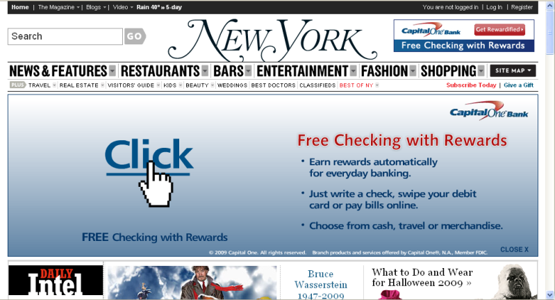
For a sample, just take a look of at this screen shot of the home page of New York Magazine.

This gigantic banner (approximately 978×299 pixels), pops up every single time that you visit its home page (as of 10/15/2009).
It is true that later on it minimizes to a banner of approximately 978×26 pixels that says “expand”. But my question is: “Why in the world are they interrupting the user experience?”
Compare the two ad versions (click for larger version):
Based on our findings, which one makes more sense to expose to web visitors when they first enter the website?

