Throughout my experience in online marketing, I have found that the auto financial service industry has a lot of great opportunities in improving its sites. From making use of responsive design to improving the user experience to creating useful, link-bait time-sinkers, there are several specific steps that auto financial services companies can take to energize their sites.
In this article I will detail 3 projects to improve these sites.
Project #1: Make Your Site Ready for Any Screen
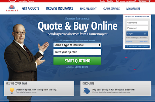
Take a look at the Farmers Insurance site.
It’s nice, makes good use of the space, and tries hard to avoid a “templated” look.
Still, there is one BIG problem.
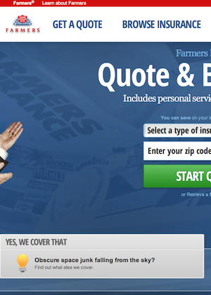
Resize your Internet browser window to about ¼ of the full screen and you should get a view like the one below:
This would mean that several users viewing the site on mobile devices could potentially run into a very frustrating experience. Remember from my previous article on responsive design, that according to a July 2011 – January 2013 survey from the Media Behavior Institute, 43.5% of the U.S. survey participants accessed the Internet via a mobile phone each week during that period. Hypothetically speaking, frustrating about 44% of your site visitors sounds like a really bad idea.
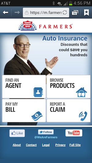
In Farmers Insurance’s defense, they do have a plan to handle traffic from mobile devices. They have a piece of code on the site that detects the device that the visitor is using and in case of the device being a mobile, it redirects the user to http://m.farmers.com. This is a mobile version of the site:
Still, this is triple the work for Farmers. First, they need to design a new site for mobile devices. Second, they have to make sure that the piece of redirect code is working. Third, they have the double task of whatever updates are made on the desktop site, they always need to be done on the mobile site as well. (Note: the content management system of the desktop and mobile sites may or may not be the same, so there is no guarantee that the updates are automatic.)
Takeaway: Responsive Web design (RWD) is a cost-effective way to address all Web users, regardless of what devices they use. Instead of creating separate versions of your site, update your site to address all screen sizes with a single site.
Project #2: Improve the Usability of Your Site
User Advocate and principal of the Nielsen Norman Group, Jakob Nielsen defines usability as “a quality attribute that assesses how easy user interfaces are to use”. When referring to websites, he recommends rating their usability with 5 components: learnability, efficiency, memorability, erros (as in how many errors do users make and how easily can they recover from those errors), and satisfaction.
Why am I giving you a lesson on site usability? Because owners of auto financial services sites, often forget that they are building sites for their users.
NOT for managers.
NOT for webmasters.
NOT for finance departments.
You are building a site for your users. Remember that first and foremost.
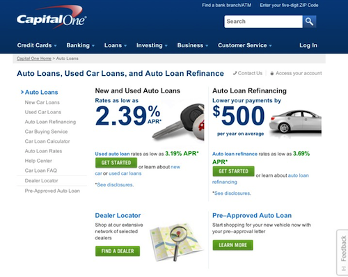
Let’s jump from car insurance to car financing by taking a look at the Capital One New and Used Car Loans page.
While you may or may not disagree with the layout of this page, you cannot disagree that there is one great feature on this page: the Feedback button.
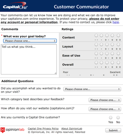
The Feedback button allows the web designers at Capital One to evaluate the decisions that they are taking on the page. Are the four highlighted sections (New and Used Auto Loans, Auto Loan Refinancing, Dealer Locator, and Pre-Approved Auto Loan) the right ones to focus on, or are users looking for something else?
If your site visitors cannot accomplish what they wanted to do on their visit. YOUR site has a problem. What are you going to do about that? Gathering input from actual visitors will allow you to answer that question.
Takeaway: Gather feedback from your site visitors to determine whether or not they are able to accomplish what they wanted to do during their site. Improve your site according to the needs of visitors, not yours.
Project #3: Create a Useful, Link-bait Time Sinker
Out of these 3 projects, this is the one that serves a triple purpose: attracting visitors to your site, increasing the average time-on-site, and increasing the number of backlinks to your site.
Continuing with the topic of car financing, let’s explore an example of a useful, link-bait time-sinker for this auto financial services category.
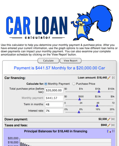
The Car Loan Calculator is hitting all the right notes in such a project.
This tool is well planned out because it allows users to solve a common problem: “what monthly car payment can I afford?” The tool makes use of great usability tricks to promote user engagement and increase time-on-site:
- Expandable “+” icons to make more efficient use of screen. If a section is not needed, the user can collapse it, and viceversa.
- Presentation of data in tables.
- Creation of a report.
- Report can be printed and is printer-friendly.
This tool is actually useful for people looking to buy a car and would be a great addition to a car financing site such as the one from Capital One. By providing a useful tool to users, you increase the probability that people will share your site on social media and create backlinks to your site (e.g. a list of top online resources when buying a car). Finally, notice how the car loan calculator was developed with responsive design so it is ready for any device, increasing the odds that people will use the tool.
Takeaway: Always be on the lookout to create a useful, link-bait time sinker for your site visitors. It will attract visitors to your site, increase your sites’s average time-on-site, and increase the number of backlinks to your site.


Howdy would you mind sharing which blog platform you’re using? I’m looking to start my own blog in the near future but I’m having a hard time deciding between BlogEngine/Wordpress/B2evolution and Drupal. The reason I ask is because your design and style seems different then most blogs and I’m looking
for something completely unique. P.S Sorry for getting off-topic but I had
to ask!
I use WordPress 🙂