In a May 2013 webinar, Peter Goodman, VP of Salesforce Marketing Cloud, discussed the current state of advertising in the social media space. He took a look at the major advertising platforms on the leading social networks.
Goodman explained how social advertising is the hottest topic in advertising, forecasted to reach a $11 billion in the US by 2017, according to BIA/Kelsey in April 2013. He explained that one of the critical decisions for advertisers is what placements to select. Goodman has found that while desktop placements see an engagement of 1 to 3%, mobile placements see over 3% engagement. If you are a US advertiser, you also need to consider that eMarketer, reported that in 2012, 62.2% of US Gen X-ers and 62.2% of US Millenials access the Internet from mobile devices monthly.
If you combine these two statistics, it becomes clear that any successful digital marketing strategy in the future needs to have a mobile component. So, this is why responsive design is 2013’s design trend.
What is Responsive Design?
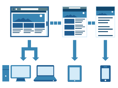
Ethan Marcotte coined the term responsive web design (RWD) in a May 2010 article in A List Apart. Responsive design is a website design approach aimed at crafting sites to provide an optimal viewing experience—easy reading and navigation with a minimum of resizing, panning, and scrolling—across a wide range of devices.
Instead of worrying about every single platform individually, developers using responsive design establish a framework to address all devices simultaneously. This way a site is tablet- and mobile-ready from the initial wireframes as opposed to having to rejigger the desktop version to other formats.
Live Example of Responsive Design
While responsive design may seem a trend for avant-garde techie publications such as The Verge and Mashable, savvy business owners are realizing the benefits of having a site that is optimized for the mobile web. HaymoreEndodontics.com, an endodontics practice in Las Vegas and Henderson, Nevada, is a good example.
Here is a screenshot of the desktop version of the endondontics site:
Now here is the mobile version of the same site:
As you can see from these two screenshots, the following has happened:
The site has been designed by Tofu Marketing, an Utah Website Design agency that creates and executes entire internet marketing strategies, to adapt according to the width of the screen from user’s device. Tofu Marketing took the time to thoroughly understand each nuance of Haymore Endodontics’ online audience and found that the site needed to meet the demands of mobile visitors in order to keep a sustainable number of potential leads.
A key element from this design approach is that long navigation bars, in this example: Home, About, FAQ, Procedures, Insurances, Blog and Contact, are minimized into a single menu button. If you click on it, it will expand to reveal all menu items.
Evaluation of Responsive Design
As business are considering how to increase traffic to their sites, social ads and mobile traffic have to be considered. Given the stats presented above by BIA/Kelsey and eMarketer, it is hard not to. However, in order to implement mobile Internet strategies, your site needs to be ready to correctly present the information to those visitors. Web design is a cost effective and efficient approach.
While other alternatives such as HTML 5 and native app development are also available, you will find that these options can quickly become expensive. If you go want to develop a native app, will you alienate Android users? A first response may be no, until you find the price tag of developing an iPhone app and an Android version. Did I mention that there is also Windows Phone and Blackberry? While every site has a different mix of mobile and tablet visitors, it becomes apparent that instead of having to choose a single device or a limited set of devices, it would be much better to address all of them at once. Responsive design does that.
This is why responsive design is 2013’s web design trend.


thanks for sharing you idea Damian! its was far more discussed in last December about the future of responsive web design. there is no second thought that in 2013 trend would be responsive web designing. and i damn sure it will last for 2014 as well.
Emma
Hi Damian, great article! Responsive certainly has a lot of buzz. I don’t think it’s the complete answer but as you say it’s 2013’s trend
Thanks for sharing, loved it!
Jordan.
Thank you Jordan. I think it’s a great way to address all browser sizes at once and that sounds very good to me.