57.6% of Baby Boomers, 62.2% of Gen Xers, and 63.2% of Millenials in the United States used mobile devices to access the web in 2012, according to eMarketer. The mobile Internet population is sizeable and rapidly growing across all age groups. A key driver for mobile Internet use is email access. Email technology provider Return Path found 88% of mobile phone users checked their email via a handheld device daily.
If you combine these statistics, it becomes clear that savvy businesses need to properly address the needs of those mobile visitors. While I have discussed thoroughly about responsive design, in this article I want to touch on two kickass user interfaces for mobile devices.
1. Microsoft Design Language
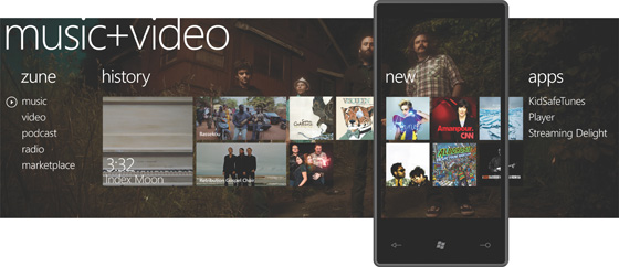
If you own a Windows Phone, perform an upgrade to Windows 8 or play Xbox 360, you have experienced first hand the power of the intuitive Microsoft design language. Also known as the metro design language, this user interface puts typography front and center. This design language puts emphasis on large text and moves away from icons to drive the user experience.
Microsoft designed this language specifically to consolidate groups of common tasks to speed up usage. For example, instead of illustrating an icon to create a playlist for several different applications, why not just use a more straightforward “new playlist” or “create playlist” button? This shift in mentality makes a lot of sense for mobile devices.
While there are critics of the Microsoft design language, it is not possible to deny the influence that it has on mobile web design. Exhibit A of this influence is the adoption of Flat UI design, an evolution from the Microsoft design language, by Facebook, Apple and Google. By putting emphasis on functionality, instead of style, designers are getting rid of gradients, dropshadows, reflections and beveled edges for the purpose of minimizing demand on graphic cards and maximizing battery life.
2. Endless Scroll Pagination
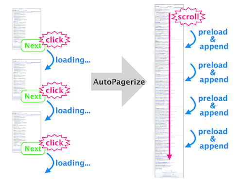
As Pinterest continues to rack up pageviews around the world, its list of imitators continues to grow. While Pinterest was not the one to invent endless scroll pagination, it is the one that pushed its popularization on mobile devices. When you search on Google or Amazon, you probably take a look within the first 10 or 20 pages. However, if you have such a long tail of results available, how in the world do you get people interested in pages 50, 356 or even 1,568? Endless pagination provides users a dynamic way to view information and does away with the friction of people not exploring more content.
Big players that have adopted endless scroll pagination in mobile are Google in its image search and Twitter on its timeline.
When using this user interface, it is critical to provide visible feedback to site visitors that new content is being dynamically loaded. Users should be able to tell that new items are available, their browser is not stuck, and the bottom hasn’t been reached.
Takeaway
As more people are using mobile devices to access the web, you need to find ways to improve their user experience. The Microsoft language design allows you to focus on function and minimize battery life, while the endless scroll pagination invites people to engage with more content.


