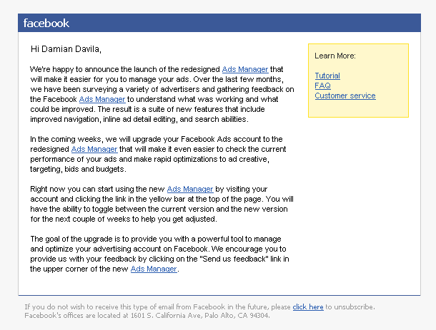
On 10/23/2009 Facebook sent out an e-mail newsletter titled “Ads Manager Announcement” to its Facebook Advertising users.

This newsletter is a great example of how to implement permission marketing, how to avoid the brochure mentality, and how to do seamless product placement.
How to Implement Permission Marketing
Click here for a full explanation of e-mail permission marketing.
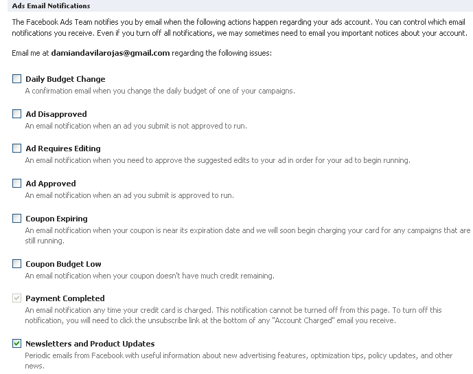
Facebook provides its users with a check-box so they can decide whether or not to give you permission to contact them.
Here is a list of the Facebook ads e-mail notifications:
 Facebook is asking its users: “Do you want to hear from us?” This little question is very powerful because Facebook is already engaging in a conversation with its users. Facebook is letting them know that it wants to keep in touch with them and likewise it is asking them, if they are ok with it.
How to Avoid the Brochure Mentality
Click here for a full explanation of the brochure mentality.
Facebook did not mess around with the objective of this e-mail.
The business objective is clearly defined (go to the Ads Manager right now!) and how this e-mail fits into it.
There are 5 mentions of the Ads Manager tool and they all are clearly defined as hyperlinks to the Ads Manager tool.
Facebook sent you this e-mail because it wants you to use its Ads Manager tool right now. Facebook will measure the success of this e-mail campaign not by the CTR on those links, but by how many dollars are generated from the use of the Ads Manager in a certain period of time.
The brochure mentality is avoided by putting the brochure as a simple link on a side bar (if you want the brochure, here it is), rather than presenting the brochure first and then putting a link to the Ads Manager at the end.
How to Do Seamless Product Placement
Everybody wants to do a little bit of money with its e-mail communications right? Facebook appears to want to do that as well.

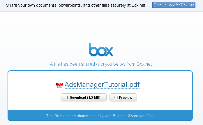
Facebook may or may not had planned to sponsor the services of Box.net, but it surely ends up just being that!
The message is clear: Facebook uses Box.net for sharing files via e-mail.
Conclusion
Great e-mails don’t happy by accident! Take some cues from Facebook and improve your e-mail marketing campaigns today.

Please for the love of god put the old design back. I can’t read anything on this new one it’s so wide! I liked the old one and this one looks like a crappy online store with the two bars down either side. Please consider putting the old one back!
Hi Anon,
Thanks for your message.
I am experimenting with the Atahualpa WP theme.
I am trying to do some A/B testing with 3 columns instead of 2.
– Damian
Surely the whole point of A/B testing is to make a design *better*. I’m not trying to criticize as I think your content is really good… I just find it really hard to read on my screen which is really wide. If you just made it so that the width is narrower it would be much better.
Thanks Anon! I really appreciate your feedback. By far, you hold the record for the quickest comment post on my blog!
What resolution are you using on your monitor?
It’s an iMac so I’m not quite sure but its a fairly wide screen, so it looks rly wide. Perhaps you could just cap off the width at a certain size to stop it from getting bigger? Not sure if that’s possible though… I’m not a coder… just the marketing guy!
Thanks for the tip.
Is it an iMac? Do you know what monitor size?
I have a couple friends with big iMac monitors maybe I could figure out what to do using their monitors.
I found it… it says:
iMac:
Resolution: 1920 x 1200
Pixel Depth: 32-Bit Color (ARGB8888)
Thank you! I really appreciate your help. I’ll work on it.
I added your blog to bookmarks. And i’ll read your articles more often!